
Print design can be considered a foundational element of design in general as certain rules are established and learned. What’s learned in print design applies well to web design, video production, and other more elaborate endeavors that are displayed here at this online portfolio.
First Design Assessment
This first example was the very first design assignment submitted as a student in Quinnipiac’s Interactive Media Graduate Program. It was meant to be an assessment of design ability when presented with information to reproduce (e.g. as a flyer). It was created with Indesign, and showcases a common early designer’s tendency…all the content is centrally aligned with no variation. Additional font experimentation probably could have been utilized as well. However, it seems to be a decent early attempt.

Typography and Design Hierarchy

Fundraising Flyer

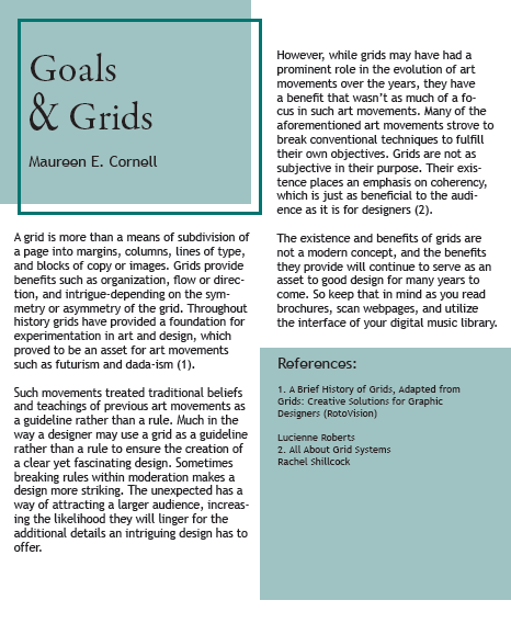
Importance of Grids
The example shown below was an assignment in which a 250 essay on the importance of grids in layout design was to be paired with visuals that exemplified this concept. The software used to execute this assignment was InDesign.
Color in Design
With this assignment, an album design was recreated by incorporating colors from an Analogous color family. The first word, “supposed” starts with a warm green-yellow, and each word following transitions through some variation of a warm color such as orange and red. The fifth color is the background, which is a shade of black mixed with a small amount of blue. The goal was to use a “cooler” color background to make the warmer, analogous colors stand out.